bar charts
A colleague of Fredrick Taylor, Henry Gantt, was responsible for the creation of the chart that still bears his name. The Gantt chart or bar chart used today was developed in the early 1900s from a several different charts used by Mr. Gantt to communicate between management and employees about what work was to be accomplished on a given day. (reference)
The bar chart is a two dimensional chart. The x-axis of the chart shows the project timeline. The y-axis of the chart is a list of specific activities that must be accomplished to complete the project. These activities are typically listed in order of earliest start on the project. The content of the bar chart are bars that show the planned (and/or actual) start and end times for each task. Since the tasks are usually arranged from earliest to latest, most bar charts show a pattern of bars that begin in the upper left of the chart and proceed to bars that complete the project displayed in the bottom right of the chart.
For the activities, duration, and sequence shown in the table below, the related bar chart is shown.
| Activity | Duration (work-weeks) |
Prior Activity |
|---|---|---|
| 1 | 3 | None |
| 2 | 5 | 1 |
| 3 | 2 | 2 |
| 4 | 3 | 1 |
| 5 | 2 | 4 |
There are many methods that can be used to create a bar chart. One of the least expensive methods is to use any of the commonly available spreadsheet software programs. The bar chart example shown above was produced using Visio 2003. Regardless of the tool used to create the chart, the x-axis always shows the time dimension of the project and the y-axis is the list of activities that comprise the project.
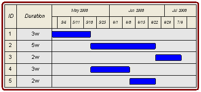
This time line must always have specific units of time designated. Clearly designating the units on a bar chart is very important since the use of "weeks" for project duration does not typically refer to calendar weeks but 5-day working weeks. Notes accompanying the Visio Bar Chart must clearly indicate to all team members that crews will not be expected to work 7-day weeks. To help visually separate the time line, larger breaks are shown on the x-axis to show the working weeks and months.
Activities are listed on the Bar Chart in to the sequence that the activity need to be accomplished. "Activity 1" appears at the top of the y-axis. The length of Activity 1 is proportional to the time needed to complete the task.
While the use of the Visio provides a very nice looking chart, consider if the bar chart had 200 activities spread across multiple pages long and wide. The use of Bar Charts on larger projects is very problematic unless careful attention is paid to the layout of the chart. Some hints here are that time grid lines should be shown on large charts. Also the name of the activity should be shown above the activity bar. Following these simple formatting techniques allows team members to find meaningful information on the Bar Chart without having to cross reference back to the y-axis activity list or x-axis timeline.
Here is a checklist for creating effective Bar Charts:
- Label the x-axis in working days or weeks
- Use "ticks" to show working weeks or months
- Y-axis shows the start of the project at time = 0
- Skip lines between bars
- Print the activity name above each bar, if possible
The difficultly with the bar chart lies in the sequence that is implied in the chart layout. Without explicit designation of the sequence there could be confusion. In the example Bar Chart above, for example, there is nothing keeping someone from moving activities 2 and 4 to the start of the project. Since the last activity in the project is not last activity in the Bar Chart, there may be additional confusion.
While there are difficulties with the Bar Chart, it remains a commonly used project planning tool today. In recognition of his achievements, the American Society of Mechanical Engineers awards a "Henry Laurence Gantt Medal" for achievements in management sciences.